I wear glasses, but take them off when I shower. We've been away for a few nights and stayed in hotels for a few of those nights. When I take off my glasses and try to figure out which of the bottles in the shower are soap, shampoo or conditioner they don't make it easy. This is what I see:
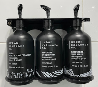
Why do shower product people think that their brand is more important than what the product actually is? Also, the graphics give no clue. Here's how they look with corrected vision:
The logical order for me would be soap, shampoo and then conditioner. Curse you Urban Skincare and all of the others that pull the same trick.


3 comments:
Agree - those bottles actually have more contrast (white on black) than usual nonsense - grey text on aqua background.
Need tactile bottles - https://www.kao.com/global/en/sustainability/topics-you-care-about/universal-design/shampoo-notches/
Could be worse. If designed by some software companies we would need to read and accept a EULA (end user licence agreement) before being able to dispense the contents!
Very interesting about the meaningful bumps on bottles. I don't recall there being any but maybe on the spout?
Tony here - Not sure why I am coming up as anonymous.
I have the same problem with reading these things in the shower.
At home I grab a thick black marker and write a “S” or “C” on the bottle.
UX In the computerworld has worked out well.
Apps that don’t conform basically fail - too big a learning curve.
In meatspace not quite the same feedback loops hence we still get water taps which are confusing and other points of friction.
Steve Jobs and others taught our cohort the value of good UX design.
Now when people like us try to explain to noobs the failures of their product design we’re shutdown as being pedants or difficult.
Post a Comment