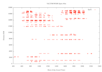
I wanted to get a feeling for HF communications to and from my location so I ripped the data for the past 30 days of my activity on 40m. The main variation is the daily cycle as the "grey zone" moves around the world, so I've just plotted against time of the day using gnuplot. Here's the result:

(Click for a larger view).
My simplistic interpretation is that for optimum long distance communication on 40m, the best times are 7:30am - 8:30am and 5:30pm - 8:00pm. The astonishing thing is that 5W can go 17,000Km at all, (remember that half the circumference of the earth is about 20,000km), but that's another story.
Here's my gnuplot script:
set title "VK2TPM WSPR Spots 40m"
set xlabel "Hour of day (Local Time)"
set ylabel "Distance KM"
plot "40mwspr.csv" title "Spots" with points
The data isn't CSV, it's just time space km.
2 comments:
Would be interesting to compare this to the location of the terminator at the same time. Maybe include bearing into the data too, as a 3d plot.
This first attempt is simplistic, basically to give me a feel for when to be on air, but yes there's lots of possible ways to analyse this data set.
The other variable I have is signal to noise, I tried displaying that as error bars but it didn't make much sense.
Post a Comment